Wednesday, April 30, 2008

Hidden art in a foreign language

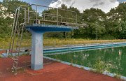
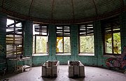
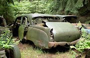
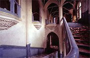
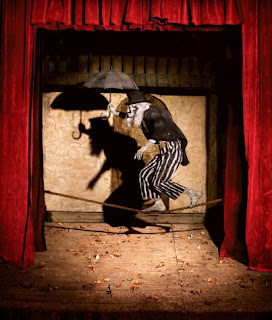
So art is suppose to be an international language. That might be true but trying to navigate an art website thats in a different language is extremely difficult. I just think its funny cause I ran across this website and I cannot figure out what its about or how to navigate it that well. I was able to figure out that the top 2 categories of links on the left hand of the screen bring you to different bodies of work on everything from urban settings to industrial parks. However I think there is something cool about not know what any of the images are about or were their from. It kind of reminds me of the classic movie "Logans Run" when the two main characters see the outside for the first time in their lives. The world is kind of deteriorated but becasue they have no idea what any of the object are or the back story behind them the bland world as we see it is fascinating to them. I have often spoke out against the use of artist statements on the basis that a work should be able to stand on its own without the aid of words. I think the pictures on the website support what I'm saying. These Images I ran across definitely stand on their own and and I doubt that an artist statement would make them any better. Its kind of like discovering a new world. You do it for the adventure and excitement. You don't always get what you want but you have to take the good with the bad. So anyways heres the website for any one that reads this blog and good luck trying to figure it out if you don't know the language. http://www.dubtown.de/

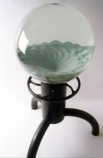
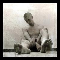
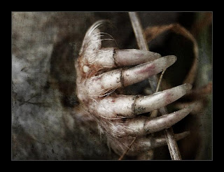
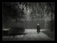
Also heres a couple of pictures from it to wet your appetite.

Paul Pfeiffer

So I had a hard time figuring how to best describe Paul Pfeiffer's work. In the end I decided to use the description of him given by the art 21 website. So this is a summary of what they had to say about him and his work. Again I got his from the art 21 website who's web address is http://www.pbs.org/art21/artists/pfeiffer/index.html#

Paul Pfeiffer was born in Honolulu, Hawaii in 1966, but spent most of his childhood in the Philippines. Pfeiffer relocated to New York in 1990, where he attended Hunter College and the Whitney Independent Study Program. Pfeiffer’s groundbreaking work in video, sculpture, and photography uses recent computer technologies to dissect the role that mass media plays in shaping consciousness. In a series of video works focused on professional sports events—including basketball, boxing, and hockey—Pfeiffer digitally removes the bodies of the players from the games, shifting the viewer’s focus to the spectators, sports equipment, or trophies won. Presented on small LCD screens and often looped, these intimate and idealized video works are meditations on faith, desire, and a contemporary culture obsessed with celebrity. Many of Pfeiffer’s works invite viewers to exercise their imaginations or project their own fears and obsessions onto the art object. Several of Pfeiffer’s sculptures include eerie, computer-generated recreations of props from Hollywood thrillers, such as “Poltergeist,” and miniature dioramas of sets from films that include “The Exorcist” and “The Amityville Horror.” Pfeiffer is the recipient of numerous awards and fellowships, most notably becoming the inaugural recipient of The Bucksbaum Award given by the Whitney Museum of American Art (2000). In 2002, Pfeiffer was an artist-in-residence at the Massachusetts Institute of Technology and at ArtPace in San Antonio, Texas. In 2003, a traveling retrospective of his work was organized by the MIT List Visual Arts Center and the Museum of Contemporary Art, Chicago.

Martin Puryear


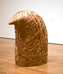
Martin Puryear is another unique artist that I came across the other day. What interested me about him, besides the fact that hes a sculptor, was that he served in the peace corps for 2 years. The reason this is interesting to me is because I'm looking into going into the peace corps when I get out of college and then when I'm done with that I might try to become a professional photographer/ artist. So in hes kinda doing what I hope to do. Anyways back to Puryear. His work can be classified as thought intensive minimalist art. Often his pieces are very plain and simple yet with their simplicity comes a comment on life. An example of this would be his piece "Box and Pole." In this piece there is a four foot square box with a hundred foot pool sticking out of it. The comment made by this piece is that there are some things that people are bigger then yet there are also things that are bigger then us. The box being what people are bigger then and the pole representing ideas such as god which are bigger then people. What I think is great about his pieces is that if you look at them long enough you would probably come to the conclusion he wants you to. Another quality of his work that I like is how natural some of them are. Many of his pieces are made out of wood or rocks instead of metal. This means your focusing more on the meaning behind the piece then the meaning behind the material. All in all I am a fan of his work becasue of how simple it is. There are no hidden messages but simply comments on the relations of things in the world.
Tuesday, April 29, 2008

Landscape Photography

So I was looking around the internet tonight for landscape photography and I discovered that its getting harder and harder to find a landscape thats interesting. Its not that the landscapes being captured aren't beautiful its just that after a while they all look the same. I mean there have been so many pictures of sunsets that now sunsets look dull to me. Its strange though because I used to be a big fan of landscape photography. That used to be all I wanted to do. In some ways it is. But I think its to find something that is never before seen. To find beauty without the aid of a sunset. Its interesting looking over the images in National Geographic. What makes them successful and what doesn't. I hate to think that the only difference between one landscape and another is how far someone had to travel to get the image. That an image from Africa is better then one shot in the U.S. Except for the few magazines that use landscape and nature photos I think the main reason people take them is for sentimental value. Even professional photographers take landscape images probably more for themselves then for their portfolio. I guess this is what makes landscapes so unique. They create sentiment for the distant. They remind the viewers that they are away from some beautiful place. In a way they are the substitution for that perfect place in our minds. Whether that place be in Africa or in the neighborhood that we grew up in.

Weird as shit

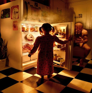
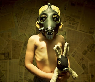
So I was stumbling around the internet tonight when I came across some weird ass shit. All of these were taken by Joshua Hoffine. He said that all of these were done on studio and who only used photo shop for color and sharpness correction. I think this is awesome becasue a few weeks ago I got an assignment to shot something attractive yet disturbing image using a Holga. Now obviously these weren't shot using a Holga but I think these definitely qualify as something that is both creepy and attractive. What I like about it is how simple the idea is. I have seen allot of photographers use children to make something odd and scary but never in this way. Whats great about them is their not Childhood fears as an adult would see them but rather as a child would see them. Another great thing about them is the variety of the fears. There's everything from monsters to clowns and even dead mothers. I mean if I was still a kid this stuff would seriously be some of my big fears. And to top it all off all the sets built and everything involved in the process was done for free by the people involved. There were no paid models but simply people willing to come together to build sets and have a little scary fun. So I've included several images but here is the link to the site I found him at. http://www.soothbrush.com/children-fear-photography/

Mel Chin


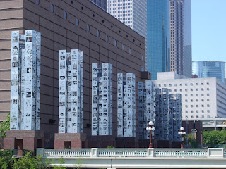
Next stop on the artist train is Mel Chin. Mel Chin was born in 1951 in Texas as the soon of immigrants. He grew up in a predominantly black and Latino community. His artwork has been motivated by political, social and environmental issues that have come up over the years. However, instead of simply commenting these problems like many other artist do his work actually involves solving the problems. A good example of this would be his "Revival Field." In this piece he creates a piece of art using plants that are designed to remove heavy metals from the ground. So this piece not only comments on the problem and how to solve it but it also partakes in the solution. Looking over his career much of his other work does the same thing. They all take a problem and solve it in a artistic way. Whats great about his stuff is that he doesn't limit himself to one particular area of interest. He has been know to creates pieces and help out in places were ever he sees a problem. This could be in the middle of a suburb or several miles out of town. Because of this his work seems to more focus on the actual problem at hand then about getting attention. He once commented that making art is all about making choices. Whether it is the choice of were to make the artwork and what it should be about. Chin has clearly made the choice to use his artwork as a guide for people. A way to influence people into making smart choices that are beneficial to society.

Ned Kahn


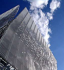
Ned Kahn is what is called an environmental artist. No he is not about trying to save the enviroment through art. His work is about expressing the enviroment. About revealing things that cannot been seen and doing so in a artistic way. This would include making things that move when wind or water hit them. Changing the patterns of smoke through hair currents. Even revealing light in a new way through the effects of wind or rain. He would probably classify himself as part scientist part artist. Much of his work involves complex calculations and figuring out how to make the invisible environment visible. I am a very big fan of his work because of how he's trying to connect people into what cannot be controlled. Yes much of his work does have patterns but they are patterns that are uncontrollable. In a way, through his work he is trying to show the acts of the divine. How there is some supernatural force out there and it influences us in the same way that the unpredictable wind influences his pieces.

Pepón Osorio


Pepón Osorio is a large installation artist from Puerto Rico. His work has been influenced by his dealings with the people and and his experience as a social worker in the Bronx. The main goal of much of his work seems to be to bring artwork back to the people. He does this in several different ways. One of his big ones is the live in where he actually has family's live with his artwork for a week. Its difficult to describe his work. Much of his pieces seem to be a 3d collage of different objects. Some are very flashy and represent art styles of the past while others are dull and appear as if they were taken from a garage. I think this is what makes his work so unique. Its a blend of other artwork to create new work. His work seems also to be about exaggeration. He takes a simple object or an idea that someone might be interested in and exaggerates the obsession of that object. In many of his pieces the walls and floors are covered with pictures all relating to the same subject matter. The purpose behind this is probably to emphasize how we are all interested in something and how it takes over a part of our lives.
Sunday, April 27, 2008

My opinion about graffiti artists.

So after writing about a couple of graffiti artist I decided it was high time that I gave my opinion about them. I'm going to be very blunt about it and say I'm not impressed. In fact I don't like you at all. The reason why is because I see you as lazy people who force other people to pay attention to you and this crap you come up with. I'm all for making new and interesting art. I love seeing sculptures that are fifty feet high and stand out in the middle of the sidewalk. But the difference between those and what graffiti artists do is the commission. Those strange fifty foot tall sculptures being put in the middle of the city were asked to be put there by the people. Either people, or an organization, collected money to higher an artist to create something that is unique and expressive. It was asked for by the people. Graffiti artists don't ask the people or owners of a building to paint. They just go. They assume that people won't mind if they paint wherever they damn well please, and if they do mind then they must be idiots. Not everyone wants to see weird ass pictures and names everywhere they look. I mean how would you like it if I went to your house and painted whatever I wanted on your walls. I think you would be pretty damn pissed. And the excuse that artist have a right to express themselves is the worst excuse ever. If that were true then serial killers should be able to keep on killing because allot of them see themselves as artists. So what this all sums up to be is not everyone likes to have crap painted onto their house. Not everyone likes a bit of weird color in the middle of their nice white wall. If you want to paint go buy a canvas like everyone one else. If you cant afford a canvas then get a job and stop depending on other people. I mean if you really want to paint on walls start with the ones in your house first. Then when those are all filled up you can either paint over them or just buy an abandoned building to paint on. And for all those graffiti artists out there. If I see you painting on something just so you can "express yourself" I'm calling the cops on you.

Another graffiti artist.


Yay another graffiti artist. This goes by the nme of Barry McGee. Before I go into the details on this gentleman's work I would like to point out that its late and I really don't give a rats ass. I'm sorry if your reading this Barry McGee but the only reason I'm writing about you on my blog is for a grade in one of my classes. Granted I'm sure your a fairly interesting person in real life its just I've written about so many artists at this point and I'm so tired of school that I just really don't care. That being said I shall go onto describing Mr. McGee's artwork.
As I mentioned before Mr. McGee is another graffiti artist. Some people are thoroughly impressed by this but I'm not. Why some of you may ask. Well Ill talk about that in my next blog. This blog is just about Mr. McGee. Anyways, back on topic, Mr. McGee is another graffiti artist who seems to like the 1920's jazz style. Allot of his work reminds me of stuff that would be out right before the depression. You know. The kind of stuff that would represent musicians that flappers would dance to. Anyways allot of his work contains the qualities of the old style jazz pictures. Big faces with big broad lines that are slightly distorted so as to make one part of the musicians body stand out more. So although he did his own thing with it its still been done to death and I'm therefore not very impressed. Some of his other work I might classify as plaid art. I mean it honestly looks like he took some crazy pop quilt and copied it onto a wall. I get the whole idea of everything can be art I just don't like it when the artwork comes out looking like something my grandma could have sewn.
To end this long rant I'm just going to say that I'm not very impressed by Barry McGee. I think that he found a way to make money off of copying older styles of art work. Sorry if your reading this McGee but come up with something creative and branch out. Fame is not an excuse for laziness and an artist that makes money off of one style will so be broke unless he expresses himself in new ways.

Saturday, April 26, 2008

Margaret Kilgallen


Margaret Kilgallen is a very well know artist who blended folk art with contemporary art. The major influences of her work are old signs and old folk culture. She was well know for her creation of signs which she made the old fashion way instead of using modern methods. Many of her pieces were created on found object and paper, such as books. She wall also well know for her graffiti with which she tagged under various names. Her artwork is very traditional in that it seems to focus on objects and pictures carefully made by hand. Calling her a purist would probably be going to far but her work seemed to emphasize the amount of effort it took to make old signs and pictures. It is this emphasis on the old that mad her work stand out. Looking at it now it looks like stuff made during the 1920's and 30's.

Tim Hawkinson


Time Hawkinson is a sculptural artist from San Fransisco California. He is best know for pieces like "Bear" and "emoter". Many of his pieces include themes from his own body. However, this being said, his work is not self portrait in the traditional style. Many of his pieces are mechanized and often include some kind of sound or device that asks the viewer to engage with the piece. This characteristic of his art makes it unique and interesting. Rather then having the viewer just look at the piece he is asking them to use other sense. He is asking them to experience the piece rather then observe it.

Thursday, April 24, 2008

Framing

So a few days ago I went down to visit the Boise art museum. At the time the art being shown was by Mardsen Hartley. Although he did have interesting pieces I was more interested in how he framed his work. It was interesting to see the wide variety of both frames and framing techniques he used in order to show his pictures. The frames ranged in every color, size, style, and material. There was almost no consistency with his prints. As for how he mounted them he did seem consistent in his use of window mounting. However, that being said, he did change the amount of space between the glass and the picture. I'm not sure if this assortment of frames is suppose to add to the flavor of the pieces or just the result of laziness. In the end though I don't think it really matters because they seemed to go well with his work. They just seemed to add to the overall vibrant colors seen in all his images. So I guess what matters when it comes to mounting and framing is that it goes with the work and the message being conveyed rather then the decor of the room.

Saturday, April 19, 2008

Edward Burtynsky


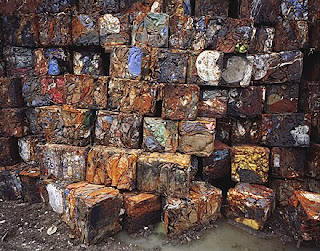
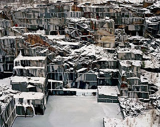
Born in 1955 Edward Burtysnky is an artist who has been featured in numerous museums. His is best know work which depicts industrial waste and the industrial process. An example of this would be his Quarries series. In this series he took pictures of open quarries around the world. It amazing to look at these quarries not only because of the amount of detail in each image but also because of how beautiful they are. Another one of his series deals with urban mines and how there are huge heaps of recycled parts that people dig through in order to make a living. Its interesting to hear the background story on these urban mines and how they came to exist. Often times they take over an entire community and force the community to rely on the money they get from recycling the heavy metals found in these trash heaps. What great about his work is how raw it is. There is no attempt to make a place beautiful through strange lighting or sunsets. Instead Burtynsky lets the places speak for themselves. He shows them as he comes upon them and captures them in a very plain style. However because of the interesting and colorful qualities of these places that are almost never seen to the average person the work stands out and is fascinating to look at. In conclusion its amazing how Edward Burtysnky is able to make interesting the waste and destruction caused by industrialization.

Saturday, April 12, 2008

Formaly good artistically Meh

So last night while I was search for photographers I ran across another gentleman who had his stuff at photo.net. Because I was short on time and his images were attractive I decided to bookmark the page so that when I went to write this blog about his work I would know exactly were to find it. However looking over his work this morning I decided it really wasn't anything that great. So the question I ended up asking myself is why I bookmarked him in the first place. Granted I was in a rush the day I did it but there were also allot of other artists that I skipped over that day. I finally came to the conclusion that the reason I bookmarked him was because of the formal qualities of his images. Almost all of his images were perfect in terms of image quality. They were perfectly cropped and lighted as well as lacking in anything negative such as color casts or dust. However with them being perfect they just weren't interesting. I had seen these images before time and time again by other artists and because of this when I actually started looking at the images instead of just skimming over them they were not able to hold my interest. I'm not sure if this is because I'm an art student or because they are the same old type of images however this showed me the power of both a well printed image and the importance of a artistic subject. Without a quality print a viewer would never know there was art to be had and would just skim over the images. On the other hand without an artistic subject matter their is nothing to keep the viewers interest. Yes it might attract them however it wont keep them becasue there is nothing to stimulate the mind. The key is to create the best of both worlds. To make something that is both artistically interesting and formally appealing.

Koscs Gábor


The next photographer I looked at was Koscs Gábor. I really don't have much info on this photographer besides that I found him on the photo.net website. Most of his work seems to be either portrait or landscape and much of his portrait pictures are very difficult to describe. Often times only the model is shown and the feeling that you get from them is dark. It is almost as if you were looking through the eyes of a madman and saw distorted people. His landscape photos are just as strange. Rather then take the typical landscape that is picturesque his have a darker feel to them. This is becasue seem to have more of a centrally important object. Often times his pictures have a dark and creepy house or a lone person/ couple in the middle of the image. This combined with scenery that seems to surround and entrap the central object makes it seem as if the borders of the image are trying to invade the middle. What also adds to the darkness of his images is his use of lines. Many of his images contain trees or walls with cracks that either blend the focus point with the background or lead the eye towards the object of interest. These lines add the to formal qualities of his pictures and help bind them together so they don't seem so intentionally odd. I think what makes many of his images so successful is how easy it is to come up with a story for them. They don't seem to have any hidden meaning but rather invite the viewer to come up with a dialog that would fit the image.

Tom Robinson


So this post is the beginning of about ten post that all talk about photographers that I found online. All these photographers I found using the stumble search engine and choose to feature on my blog because they have some work that peeks my interest.

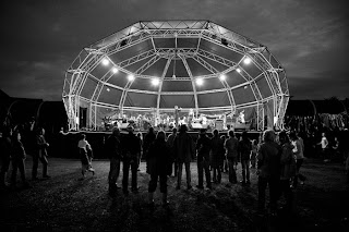
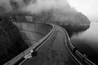
The first of these photographers is a man by the name of Tom Robinson. Although his online portfolio is fairly small he does have some interesting work. However I should clarify that in this case I mean interesting because of the formal elements of the photograph, not because of whats in the image. It would be fair to say that Tom Robinson is a landscape photographer. Yes he does have a few images that might be considered portrait style however in general the main theme of his work is landscapes and quite urban scenes. Much of his work also seems to consist of trip photography. Granted some of the best photos are taken while on vacation but his stuff definitely has a touristy feel to it. I think that out of all of his work that I have viewed some of his best stuff seems to be black and white. He seems to have a natural sense of light and shadow. He knows what needs to be lit and what doesn't to make a quality image. I think that if he was to take this further he might be able to achieve some very unique artwork.

Tuesday, April 8, 2008

Troy Paiva's color photos


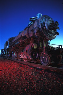
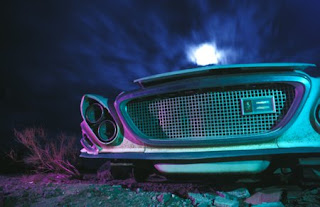
While stumbling around the internet the other day I came across Troy Paiva's website. What interested me about his site was his fantastic colors in what seems to be night photography. At the time I was shooting night images for the first time and it was interesting to see how color changes at night. In Paiva's picture although there is a blue cast making the image cool there are also bright reds, yellows, greens, and other colors that pop. This is because instead of having our focus on the sky or the sunset our focus is on the raw colors of the objects. This is one of the great things I discovered while doing my own night photography. In taking the picture an objects background is no longer important becasue the background is often dark and uncontrollable. So instead the photographer must focus more on the actual object and the framing of it. Making sure that enough light is let in to give us color but not to much to blow out certain areas. I think that night photography is more technical then most other simply becasue you have to consider everything and make sure its perfect. Its not like day photography were you might come upon an image. You have to make the images with your camera.

Monday, April 7, 2008

Color of smoke


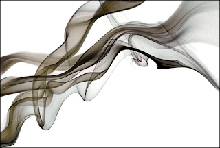
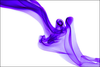
So a few days ago I signed onto the stumble website and have been using it to search for art. Whats great about stumble is it just randomly finds web sights that fit your criteria of what you want to look at. So instead of spending time going out and tracing down artists now i just press a button and a new one randomly pops up. Whats also great about it is the artists that pop up aren't always famous or well know. This means I get to look at art produced by people who might never have their stuff in a museum. So while stumbling today I found Colored smoke by Graham Jeffery. Colored smoke is exactly what it sounds like. It is images of smoke, both colored and uncolored. From what I read from his site he apparently makes the smoke from incense sticks then shots them at a fast shutter speed in a studio. A couple of the things he mentioned that are important for shooting smoke is good lighting and a large depth of field. This is because smoke is always moving and you cannot get a definite focus on it. Also without proper lighting the smoke is hard to discern against the backdrop and its detail is lost. Whats great about this form of art is how much and how little control the artist has. Because he is shooting in his studio he can control the lighting the depth of field and has a life of its own their is no way he can exactly predict which direction its moving or what shapes it might take. In a way it is very similar to nature photography. The photographer does have a certain degree of control but in the end the results are controlled by the billions of little things that, although small by themselves, can make or break an image.

Pictorialism & Holga 341


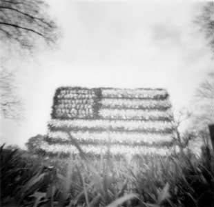
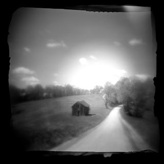
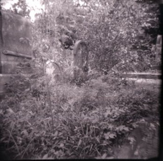
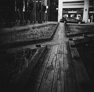
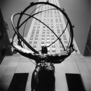
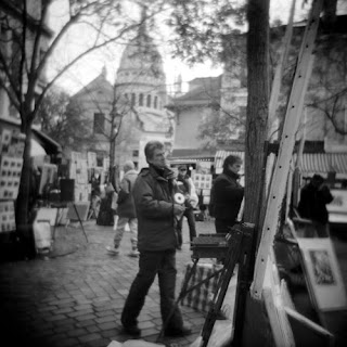
Pictorialism is an artistic style in which images are made so that they are similar to paintings. The original reason behind this was because at first photography was not considered an art. In order to show the artistic possibilities of photography photographers made images with a soft focus and that showed classical objects or scenes. By doing this they resembled paintings in both look and context. The images shown above contain some of the elements of the pictorialism movement such as a classical scene or a soft focus. These images as well as the images below were taken on Holga camera's. Because of the narrow depth of field as well as the square framing of the images the Holga camera takes pictures that look as if the belong to the pictorialism movement.