Continuing on with a look at artists who specialize in 3-d sculptures I ran across Anthony Gormley. Anthony Gormley is an Englishmen who has become very well know for his sculptures that represent the human image. Most of his pieces are created from body molds of himself which he then alters or enlarges to his needs. Although he does have alot of smaller life size work some of his best know pieces are giant sculptures that overlook places like beaches or cities. His largest piece " angel of the north" is 20m high by 54m wide and is Britains largest sculpture. In talking about his work he says it is not suppose to be symbolic of something but representational of a time or action. Its almost like making a three dimensional picture. What makes much of Gromleys work so great is and popular is that he is using the human image to convey a message and doing it in a public way for all to see.
Friday, March 28, 2008
Anthony Gormley
Continuing on with a look at artists who specialize in 3-d sculptures I ran across Anthony Gormley. Anthony Gormley is an Englishmen who has become very well know for his sculptures that represent the human image. Most of his pieces are created from body molds of himself which he then alters or enlarges to his needs. Although he does have alot of smaller life size work some of his best know pieces are giant sculptures that overlook places like beaches or cities. His largest piece " angel of the north" is 20m high by 54m wide and is Britains largest sculpture. In talking about his work he says it is not suppose to be symbolic of something but representational of a time or action. Its almost like making a three dimensional picture. What makes much of Gromleys work so great is and popular is that he is using the human image to convey a message and doing it in a public way for all to see.
Thursday, March 20, 2008
Thursday, March 13, 2008
Art 108 Journal/Sketchbook assignment Design Terms
Emphasis: An object or style that is of special importance. A focus on one particular object or style over all others.


The emphasis of George Segal’s sculptures is the human form but presented in a sort of ghostly way.
Illusion of motion: A deceptive or misleading image or object that appears to the viewer as if it is in motion or in some action while in reality the image or object is standing still. This is a result of an image or object being created mid action and therefore the viewer wants to complete the action in their mind.


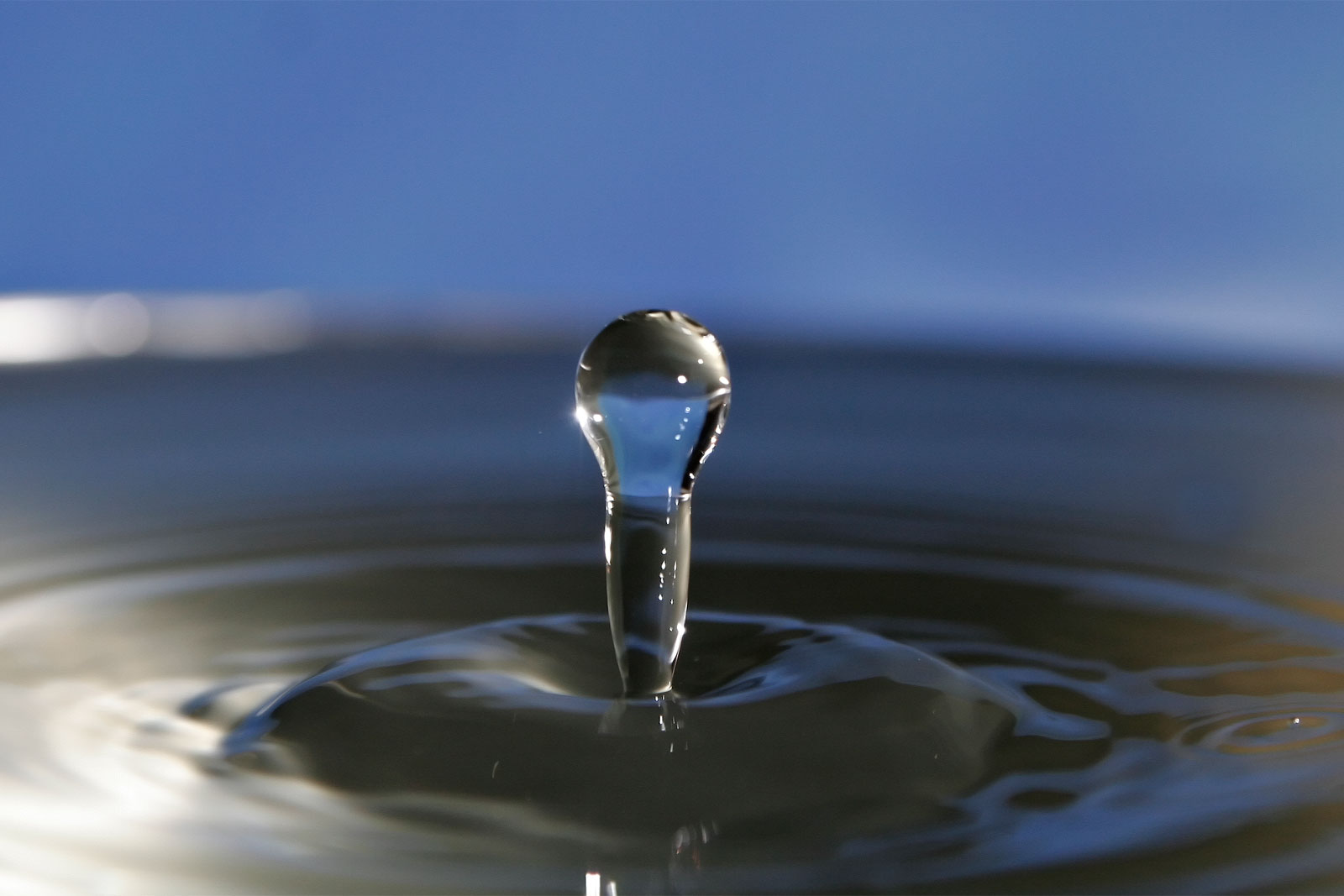
Water droplets and splashes are a good example of the illusion of motion because we have seen water splash before and our mind desires to see the end of the splash but we are unable to.
Abstract: Images or objects that is non-representational. These images or objects generally have no correlation to the real world and often are an attempt to depict intangible things such as emotions. Although they might remind the viewer of something they are in no way a depiction or a representation of it.
This image is abstract because it is non representational and most likely expresses some emotion or thought that is indescribable.
Variety: A way of combining artistic elements to create complex relationships. It is achieved by combining diverse artistic elements in order to increase the visual appeal.

This piece of art contains a wide variety of different artistic elements such as hue, tint, context, hidden meaning, etc.
Volume: The amount of space found or seen within a form.

Because of the way this is painted and where it was hung in the church it made it seem as if the church had a greater volume then it actually did.
Monochromatic: A piece consisting of a single color or hue but may includes different tints or shades of the hue.
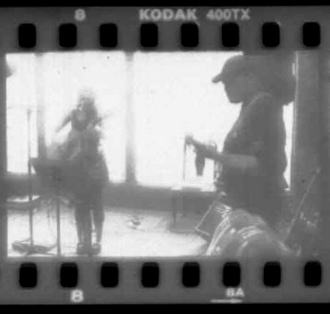
This images is monochromatic because the entire image is the same hue.
Warm/ Cool Color: warm colors are colors such as red orange and yellow which are associated with heat. Cool colors include greens blues and violets which are generally associated with cold.


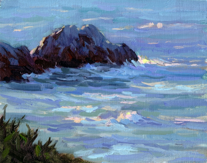
The first image contains warm colors while the second contains cool colors.
Negative: A tonal inverse of a positive image. All colors, tints, and shades are reversed from their original so white would normally be light is now dark and what would be red now appears cyan. This is typically seen in photography when a light sensitive materials are subjected to photosensitive chemicals.
This is a negative image. When it is used to make prints all the light areas will become dark and all the dark areas will become light.
Works Cited
http://www.artincanada.com/arttalk/arttermsanddefinitions.html#m
http://www.artlex.com
Kleiner, Fred. Mamiya, Christin. Gardner’s Art Through The Ages The Western Perspective. Volume 2 Twelfth Edition. Thomson Wadsorth, 2006.
http://wikipedia.org
The emphasis of George Segal’s sculptures is the human form but presented in a sort of ghostly way.
Illusion of motion: A deceptive or misleading image or object that appears to the viewer as if it is in motion or in some action while in reality the image or object is standing still. This is a result of an image or object being created mid action and therefore the viewer wants to complete the action in their mind.
Water droplets and splashes are a good example of the illusion of motion because we have seen water splash before and our mind desires to see the end of the splash but we are unable to.
Abstract: Images or objects that is non-representational. These images or objects generally have no correlation to the real world and often are an attempt to depict intangible things such as emotions. Although they might remind the viewer of something they are in no way a depiction or a representation of it.
This image is abstract because it is non representational and most likely expresses some emotion or thought that is indescribable.
Variety: A way of combining artistic elements to create complex relationships. It is achieved by combining diverse artistic elements in order to increase the visual appeal.
This piece of art contains a wide variety of different artistic elements such as hue, tint, context, hidden meaning, etc.
Volume: The amount of space found or seen within a form.
Because of the way this is painted and where it was hung in the church it made it seem as if the church had a greater volume then it actually did.
Monochromatic: A piece consisting of a single color or hue but may includes different tints or shades of the hue.
This images is monochromatic because the entire image is the same hue.
Warm/ Cool Color: warm colors are colors such as red orange and yellow which are associated with heat. Cool colors include greens blues and violets which are generally associated with cold.
The first image contains warm colors while the second contains cool colors.
Negative: A tonal inverse of a positive image. All colors, tints, and shades are reversed from their original so white would normally be light is now dark and what would be red now appears cyan. This is typically seen in photography when a light sensitive materials are subjected to photosensitive chemicals.
This is a negative image. When it is used to make prints all the light areas will become dark and all the dark areas will become light.
Works Cited
http://www.artincanada.com/arttalk/arttermsanddefinitions.html#m
http://www.artlex.com
Kleiner, Fred. Mamiya, Christin. Gardner’s Art Through The Ages The Western Perspective. Volume 2 Twelfth Edition. Thomson Wadsorth, 2006.
http://wikipedia.org
Monday, March 3, 2008
More ideas for on site installation
So this week our assignment for our 3-d design class was to create an plastic mold of something organic and place it in a site specific location. Although it's not organic I was thinking of creating a mold of a car and wiring to the underside of a bridge. Yes I'm aware it would be very time intensive but I think it would be worth it. Before I made the mold though I started calling around asking anybody if they would be willing to help me strap it to the underside of the bridge. I was amazed by the resounding no I got from everyone. It seems that people are afraid of getting in trouble for creating public art. Granted I wouldn't be asking permission to strap it to the bridge but i Kinda think that's the whole point of it. To place something were its not suppose to be so that other can enjoy something new and fresh in their day to day routine. Anyways everyone saying no got me to thinking how sad it is that people fear to express themselves because they might get in trouble. And I don't mean expressing themselves with tattoos or a speech but in actions. People are afraid if they take some sort of action outside the norm then they will become persecuted and it will ruin their lives. In most cases this isn't true but even in the cases that it is true I still believe its worth it. Life isn't worth it if we can't express ourselves. It is our ability to express our selves as individuals that make us great. To express ourselves not only in words but in actions. If you look at history the world has been shaped by people who choose to stop worrying about what will happen to them and did something because it meant something to them. For many of us there is a work of art that means something fantastic to us. Every time we see it we are instantly inspired to create and express. However if we deny our desire to create and express ourselves because we are afraid something bad will happen then we shall never see our ideas come to life and we become domed to live in a way that has been lived by billions of people before us. Art allows us to express ourselves and we should not be afraid to do that, under any circumstances.
Elliott Erwitt

Elliott Erwitt is the so called master of the indecisive moment. Born in Paris France in 1928 Erwitt has become well know for his black and white magazine photography. Many of his images capture ironic instances in the world that would be very hard to come by in every day life. To say he is a master of capturing the moment using black and white film would be an understatement. His ability to capture a moment in perfect lighting and contrast is fantastic. I am unsure of how many of his images have been staged. I imagine that most of his magazine photographs are set up. But the images that arn't set up. The ones that he took on the fly are are masterly done. Almost every one of his images I have seen is perfectly lit and has a perfect contrast. Something of note is his use of animals in his pictures. It is likely that the reason behind him using dogs in much of his work is because dogs are are seen as unpredictable creatures yet they can be very easily trained to stay for use in a photo.
Art in school.
After several weeks of the new semester I am starting to get annoyed by my studio classes. It isn't because I have to produce work but because of the amount of time were given to produce it. I am a firm believer in not rushing an artist. I think that if an artist has a contract he has a schedule he has to keep but typically if you set up a schedule you would allow yourself enough time to produce quality. Often times I feel rushed to produce a piece and therefore the piece lacks quality. Yes I understand that because school is short we have to rush assignments but its kinda like whats the point of the project if we are unable to fully explore it. The other thing to take into account is problems that arise during the creative process. This week alone I had to re shot one assignment and restart another because my original ideas didn't work out halfway through the process. This is probably the complaint of every art student out there but I still feel the need to gripe about it because we are being graded for quality yet we are not given conditions that we can produce quality work in. In some cases I get more discouraged by studying art then I do if I'm free t o make it. I guess this might be to weed out the week but I always saw the point of school to encourage you to do something, not to discourage you.
Saturday, March 1, 2008
Koen Demuynck


While trying to find interesting photographers I decided to type the phrase "strange photographers" in the Google search engine. By doing this it gave me thousands of images of things under the title of "strange." Out of all of these one image peaked my interest and lead me to looking at the work created by Belgium photographer Koen Demuynck. It is hard to exactly classify what style he follows however it would probably be some between photo montage and commercial stock photography. Most of his work has to deal with either commercial products or with the real and surreal. One of my favorite series is the not equal series. In this series he pictures several different circumstances were one object is not equal to another such as a bull not being equal to a cow. Another one of his interesting series features train workers performing superhuman work. Although many of his images are photo shop created they do not appear to be cheap or hokey but are cleverly created. What makes so many of his images unique is the little one liners. They create a small joke for the viewer who does not wish to look at the image for that long while creating a ironic scene for those who do. Combined with the detail provided in each image his work appeals to all people.
Subscribe to:
Posts (Atom)